
Did you know over 1,000 partner connectors are now available for data visualization? This has changed how businesses analyze information. Google Data Studio has made complex data easy to understand and visually appealing for professionals in all fields.
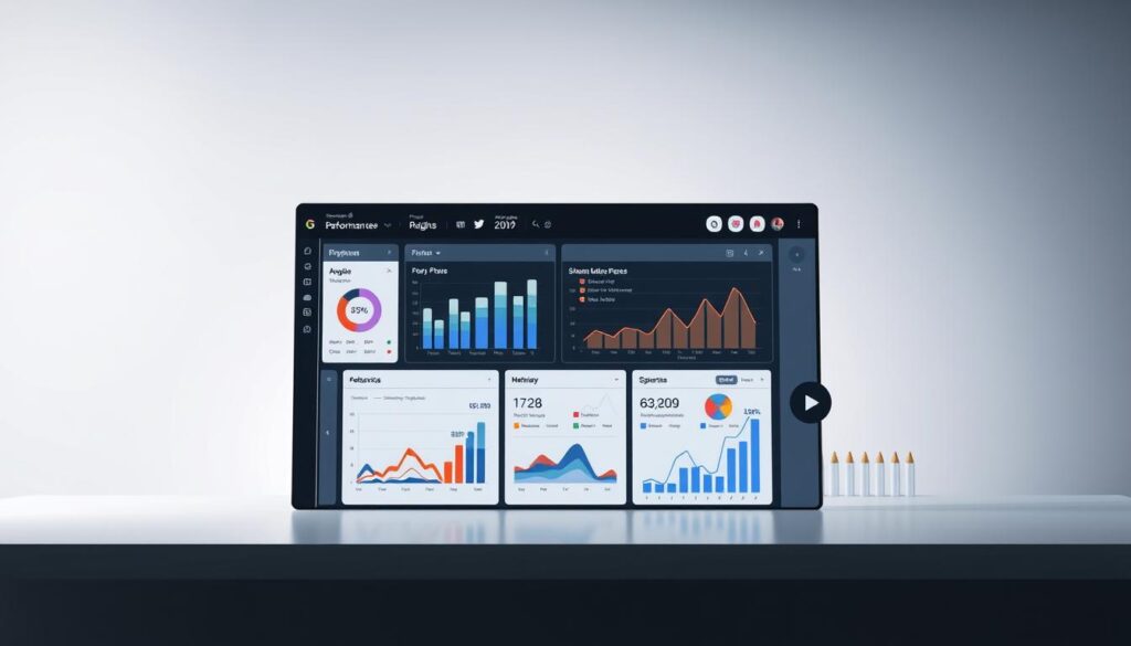
I’m excited to show you how to use Google Data Studio. This platform lets users create dynamic, interactive reports. It turns numbers into insights that matter. Whether you work in marketing, business analysis, or entrepreneurship, learning this tool can boost your data storytelling skills.
Google Data Studio has an easy-to-use interface. It lets you combine data from Google Analytics, Google Ads, and YouTube analytics. With features like real-time updates and collaboration, it’s the future of business intelligence.
Key Takeaways
- Google Data Studio provides complete data visualization solutions
- Multiple data sources can be combined into one report
- Real-time data updates give current insights
- Collaborative features help teams work together
- It’s free with lots of customization options
- Supports over 1,000 data connectors
Introduction to Google Data Studio
As a business intelligence expert, I’ve found a game-changing tool. Google Data Studio turns data analysis into a visual story. It creates dynamic, interactive dashboards that make complex data easy to understand.
This free tool has changed the way we see data. It lets users connect, analyze, and share information from many sources. With support for over 500 data sources, it’s open to professionals in all fields.
Unveiling Google Data Studio’s Core Functionality
Google Data Studio does more than just report data. It updates data in real-time and integrates smoothly. Users can make custom reports with advanced data analysis that turns numbers into insights.
Key Features That Set It Apart
This tool stands out because of its strong features. It lets users create interactive visuals like tables, graphs, and charts. It also has a function for team collaboration, making data reporting easier.
Transformative Benefits for Business Intelligence
Google Data Studio makes data analysis easy for everyone. It has a simple interface that doesn’t need technical skills. It’s great for tracking marketing, sales, or financial data.
It helps businesses understand their data better. By combining data from different sources, it gives deep insights for making decisions. Its ability to handle up to 12 data sources in one report is key for today’s data experts.
Setting Up Your Google Data Studio Account
Starting with data storytelling is now easier than ever. Google Data Studio is a powerful tool for making interactive reports. These reports turn raw data into useful insights. Let’s go through setting up your account and exploring the interface.

You’ll need a Google account to start. The platform works with both personal Gmail and Google Workspace accounts. Launched in 2016, Google Data Studio is a top choice for professionals to quickly visualize complex data.
Creating Your Account
Creating an account is simple. Just log in with your Google credentials. The platform offers over 50 pre-built templates to help you get started. These templates meet different business needs, like YouTube Channel Analytics and Google Ads Overview.
Navigating the Interface
The interface is easy to use. You’ll see a clean dashboard for quick access to reports and templates. It connects to many data sources, including Google Analytics, Google Sheets, and Search Console. This makes gathering data easy.
Pro tip: Make sure you have administrator privileges when connecting data channels. This will give you more access and reporting options.
Google Data Studio has real-time updates and easy sharing. Reports update instantly, giving you quick insights. You can share reports like Google Docs, with flexible link-sharing settings.
As you explore, you’ll see how data storytelling becomes more accessible and engaging. Google Data Studio’s tools make it easy.
Connecting Data Sources
Data integration is key to making Google Data Studio visualizations powerful. I’ll show you how to link different data sources. This turns raw data into useful insights.
Google Data Studio has over 300 partner connectors. This makes exploring data flexible. You can import data in various ways, from direct connectors to file imports.
Native Google Connectors
Google has a strong set of native connectors for easy data integration. These include:
- Google Sheets
- Google Analytics
- Google Ads
- Google Search Console
- YouTube
- BigQuery
Importing Data from Different Sources
There are three main ways to connect data sources:
- Direct connectors for live data
- Spreadsheets for data migration
- Centralized databases for migration
Authentication and Access
You must authenticate your account before accessing data. This keeps your data safe and controlled. You can use owner’s, viewer’s, or service account credentials.
Advanced Data Source Options
Google Data Studio has advanced features like data freshness and row-level security. These options let you manage data updates. This keeps your reports up-to-date and relevant.
Pro tip: Use extracted data sources for better performance. This also helps in creating consistent reports across your organization.
Designing Your First Report
Creating an effective data visualization needs careful planning and creative design. Google Data Studio helps users turn raw data into engaging visual stories. These stories share insights quickly and clearly.

When you start designing your first dashboard, you’ll find many template options. These templates can help kickstart your data storytelling. Google Data Studio offers over 20 chart types, giving you lots of ways to show information.
Choosing the Right Template
Google Data Studio has pre-built templates for different reporting needs. You can find templates for website traffic, social media, and marketing performance. It’s a good idea to check out these templates to see how they work and how you can use them for your needs.
Adding Charts and Graphs
The platform supports many visualization formats, including:
- Pie charts
- Bar charts
- Time series graphs
- Geographic maps
- Scorecards
Customizing Your Layout
Customization is important in data storytelling. You can change chart sizes, colors, and layouts to make your report look good. The platform makes it easy to mix data from different sources, creating detailed and insightful visualizations.
Pro tip: Focus on clarity and simplicity when designing your dashboard. This way, your data can tell a clear and impactful story.
Utilizing Filters and Controls
Google Data Studio turns raw data into powerful visuals. It makes exploring data easy with its strong filtering tools. Users can dive deep into their data.
Filter controls are key for customizing data visuals. They let users segment and analyze data with great precision. Advanced filtering techniques boost report interactivity.
Types of Filters in Data Studio
Google Data Studio has many filter types for deep data exploration:
| Filter Type | Function | Use Case |
|---|---|---|
| Input Boxes | Specific string value filtering | Precise data selection |
| Date Range Selectors | Temporal data analysis | Time-based insights |
| Dropdown Menus | Category-based filtering | Segmenting data groups |
Adding Interactive Controls
It’s smart to add filters at three levels: report, page, and chart. Report-level filters cover everything, while chart-level filters control specific visuals.
Best Practices for Using Filters
When making interactive reports, keep it simple and user-friendly. Use conditions like “Equals,” “Contains,” and “Between” for clear data views. Good filters make complex data easy to understand.
Sharing and Collaborating on Reports
Data integration is easy with Google Data Studio’s sharing features. As a business intelligence expert, I’ve found many ways to share and work on reports with teams and organizations.
Exploring Sharing Mechanisms
Google Data Studio has many ways to share reports. You can make public links, invite people, or limit access to certain users. It has different permission levels to keep data safe while making teamwork easier.
Collaborative Sharing Strategies
Here are some tips for sharing reports well:
| Sharing Method | Access Level | Use Case |
|---|---|---|
| Public Link Sharing | View/Edit | Broad organizational access |
| Email Invitation | Specific Permissions | Targeted team collaboration |
| PDF Export | Static Report | Offline sharing |
Report Export Options
Exporting reports adds more flexibility. You can download PDFs, share links, or embed reports on websites. Pro tip: Always check permissions before sharing to keep data safe.
Advanced Collaboration Features
Google Data Studio has advanced tools for teamwork. You can schedule report delivery and share on social media. These tools help share important insights quickly and clearly.
Effective sharing turns data into useful knowledge for the whole organization.
Advanced Features and Techniques
As a data professional, I’ve found that Google Data Studio has amazing advanced features. These tools can change how you handle complex data challenges.
Calculated fields are a big deal in data analysis. They let you create special metrics not found in standard reports. You can mix different data points to uncover insights that aren’t obvious at first glance.
Utilizing Calculated Fields
Calculated fields help you make custom metrics for your business needs. You can use existing data to create detailed calculations. This gives you a deeper look at your performance.
Exploring Data Blending
Data blending is key for full reports. It lets you mix data from various sources easily. This makes your business performance clear. Google made it easy to connect different data sources in September 2017.
Embedding Reports on Websites
Embedding reports on websites changes how businesses share info. Data Studio reports can be integrated into websites. This gives everyone real-time, interactive dashboards for clear insights.
Mastering these advanced techniques will elevate your data storytelling capabilities.
Conclusion and Next Steps
I’ve shown you the amazing world of Google Data Studio. It’s a top reporting tool that changes how businesses use data. With 18 native connectors and over 100 third-party options, it lets users make dynamic, interactive reports.
Google Data Studio is more than just a tool. It’s a full solution for making decisions with data. Its drag-and-drop feature, real-time data, and mix of data sources make it key for professionals. It helps them improve their data visualization strategies.
As you keep using Google Data Studio, explore its advanced features. Look into calculated fields, geospatial visualizations, and the Data Studio API. These can take your reports from simple charts to detailed, useful insights.
Google Data Studio is great for anyone, from small business owners to data analysts. It’s a powerful tool to turn data into stories. Start playing around, connect your data sources, and see what you can do with your data today.

