
Did you know 90% of business leaders use data visualization to make big decisions? Creating a Google Data Studio account turns raw data into insights that guide your organization’s strategy.
As a data expert, I’ve found Google Data Studio (now Looker Studio) to be a powerful tool. It turns complex data into clear, actionable dashboards. With a Data Studio account, you get free data visualization tools that change how you analyze and share information.
Signing up for Google Data Studio is easy and quick. It takes just a few minutes. Whether you run a small business, work in marketing, or are a data analyst, this tool offers a simple way to connect, visualize, and share your data.
Key Takeaways
- Google Data Studio is a free visualization tool
- Create an account to transform complex data into clear insights
- No technical expertise required to get started
- Compatible with multiple data sources
- Enables interactive and customizable dashboards
Understanding Google Data Studio
Google Data Studio changes how businesses turn data into visual insights. It’s a tool for creating stunning, interactive reports. These reports tell stories with data.

When I started with Google Data Studio, I found a platform that makes data easy to understand. It connects to many data sources. This makes it great for marketers, analysts, and business pros.
What Exactly is Google Data Studio?
Google Data Studio is a free platform for making data dashboards. It lets users connect different data like Google Analytics and Google Sheets. This way, you can make detailed reports.
Key Features That Set It Apart
| Feature | Description |
|---|---|
| Data Connectivity | Connect 20+ data sources seamlessly |
| Visualization Options | Multiple chart types including bar, pie, time series |
| Collaboration | Real-time sharing and editing capabilities |
Benefits of Using the Platform
The biggest plus is its intuitive interface. You don’t need to be tech-savvy to make dashboards look professional. It also supports real-time collaboration. This lets teams work together smoothly on data projects.
“Google Data Studio transforms complex data into clear, actionable insights” – Data Visualization Experts
Whether you run a small business or are an analyst for a big company, this tool is flexible. It lets you design reports that share your data’s story well.
Creating Your Google Account
Setting up a Google account is the first step in your data studio guide. I’ll show you how to start with Google’s easy tools. Google makes it simple for anyone to begin.

To start with data studio account creation, go to the Google account page. You’ll need your name, email, and a strong password. Google suggests mixing letters, numbers, and symbols for better security.
Essential Sign-Up Requirements
Get ready with these details:
- A unique email address
- Valid phone number for verification
- Date of birth
- Recovery email (optional but recommended)
Verification Steps
Google will ask you to verify your account. This might be by phone or email. Pro tip: Use a personal email address you check often for important updates.
Your Google account will open the door to Data Studio and more Google services. This makes your data journey easy and efficient.
Setting Up a Data Studio Account
Starting with Google Data Studio is easy and can change how you see and analyze data. I’ll show you how to make a data studio account. You’ll learn to use this powerful tool for reporting.
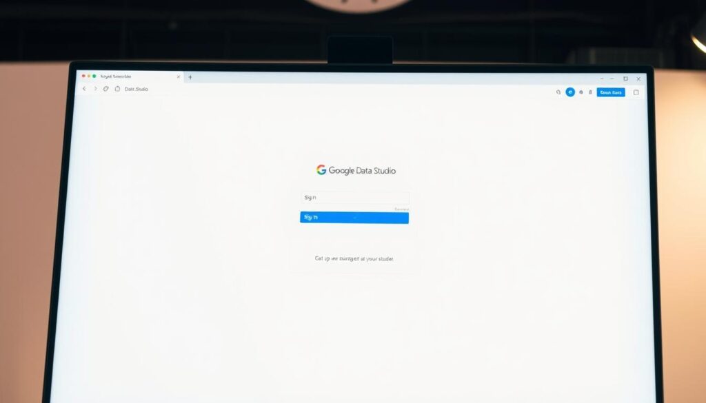
To start, you need a Google account. Go to datastudio.google.com and click “Start for Free.” This starts your account setup.
Accessing the Platform
When you get to the main page, you see Reports and Data Sources. Reports let you make data visualizations. Data Sources help you link different data sources.
Understanding the User Interface
The interface is easy to use. On the left, you can make new reports, see old dashboards, and manage data. The middle area is for building your visualizations.
| Interface Component | Primary Function |
|---|---|
| Reports Panel | Create and manage data visualizations |
| Data Sources | Connect external data platforms |
| Workspace | Design and customize dashboards |
As you set up your account, explore each part. The design is user-friendly. It helps you make insightful reports fast and well.
Connecting Data Sources
Starting with Google Data Studio, linking the right data sources is key for making great visualizations. The sign-up process opens a world of data integration. This can change how businesses see their data.
During the sign-up, I found Google Data Studio works with many data sources. It includes native Google platforms like Google Analytics, Google Ads, and Google. This makes importing data easy and quick.
Exploring Supported Data Sources
My experience shows many connection options, not just Google’s. You can also connect with third-party platforms like:
- Facebook Ads
- MySQL databases
- BigQuery
Connecting Your First Data Source
Connecting a data source is easy. Start with something you know, like Google Analytics. Click “Add Data Source,” pick your connector, and give access. Pro tip: Make sure you have the right permissions first.
Data Studio is flexible. You can make live connections that update instantly or use data sources for faster performance. This lets you control your data visualization strategy fully.
Tips for Effective Data Visualization
Creating powerful data visualizations needs careful planning and design skills. I’ve worked a lot with data studio account creation guide techniques. I’ve found that good dashboards make complex data easy to understand and use.
When making dashboards, pick the right visualization types for your data. Google Data Studio has many charts like time series graphs and scorecards. Each chart should show something important, like trends or how things are doing.
Best Practices for Dashboard Design
Good dashboard design starts with knowing your audience. Think about who will see your report and what they need to know. Use clean layouts, consistent colors, and easy navigation so your audience can get the key info fast.
Leveraging Templates in Google Data Studio
Data Studio has pre-made templates to help you get started faster. These templates have nice layouts and visualizations for different fields. Using a template can save time and give you ideas for your own dashboards.
Continuous Improvement for Your Reports
Data visualization is a process that keeps getting better. Always check your dashboards, ask for feedback, and make changes. See how people use your reports and improve them to make them clearer and more useful. With time, you’ll get better at telling stories with data.

