
Are you ready to unlock the power of data visualization? Let’s create a custom Looker dashboard that meets your business needs. In this guide, we’ll explore Looker’s features to design captivating data visualizations. These will help drive informed decision-making.
Key Takeaways
- Understand the capabilities of Looker, a leading business intelligence and data analytics platform.
- Learn how to set up your Looker dashboard and connect to various data sources.
- Discover best practices for designing effective dashboard layouts and selecting the right visualizations.
- Explore the process of customizing visualizations in Looker, including filters, parameters, and interactivity.
- Gain insights on sharing and collaborating on your Looker dashboards with your team.
- Uncover strategies for maintaining and updating your Looker dashboard for ongoing success.
- Leverage the Looker Marketplace to access a wide range of custom visualizations and enhance your data presentation.
So, are you ready to transform the way you visualize and analyze your data? Let’s dive in and unlock the full potential of Looker dashboards!
Introduction to Looker Dashboards
Looker is a top-notch platform for business intelligence and data analytics. It lets users make interactive dashboards and data visualizations. This way, they can dive into data, find insights, and share them in a fun and useful way.
The platform is super flexible. It lets users make dashboards that fit their business needs perfectly. This helps make decisions based on data.
What is Looker?
Looker is a cloud-based analytics tool. It has lots of features for exploring and reporting data. Users can link it to many data sources, like databases and cloud services.
It turns raw data into useful insights. Looker is easy to use, making it great for businesses of all sizes.
Why Use Looker for Data Visualization?
Looker has many ways to show data, like charts and maps. Users can make reports that people can interact with. This makes exploring and reporting data better.
Looker Studio connects to lots of data sources. This includes databases, Google Marketing Platform products, and social media. It gives a full data exploration and reporting experience.
Looker also has teamwork features. These let people work together on reports in real time. They can share, edit, and comment on reports. This makes working with data and reports smoother.
For admins, Looker has tools to manage users and assets. This keeps data safe and makes using dashboards easier.
Upgrading to Looker Studio Pro adds more tools for teamwork and management. It also gives access to Google Cloud Customer Care. This makes exploring and reporting data even better.
Setting Up Your Looker Dashboard
To build a strong Looker dashboard, start with the basics. Make sure you have the right permissions and access to the needed LookML models. You’ll need to manage access, edit folders, save content, and view user dashboards.
Step-by-Step Setup Process
To start, use the “Create” button in the left panel or create from a folder. Name your dashboard, pick a save spot, and add tiles or text. If using a Look or Explore, save it as a new dashboard with a title, folder, and filters.
Effective Configuration Tips
When setting up your dashboard, balance tile numbers and complexity. Looker has three tile types: Query Tiles, Look-Linked Tiles, and Text Tiles. Use them to make your dashboard clear and useful for your business.
| Tile Type | Description | Use Case |
|---|---|---|
| Query Tiles | Shows specific data without cluttering folders. | Tracking key performance indicators and monitoring trends. |
| Look-Linked Tiles | Updates all tiles if the query changes. | Maintaining consistency and synchronization across dashboards. |
| Text Tiles | Labels and customizes dashboard components. | Enhancing the overall design and user experience. |
With careful setup, your Looker dashboard will be a powerful tool. It will help your team make better decisions and track performance.
Exploring Data Sources in Looker
Looker lets users connect to many data sources. It uses strong data models for great data visualizations. On the Explore page, users find lots of insights for better decision-making.
Connecting to Databases
Looker is great at linking to different databases. It works with SQL systems like MySQL, PostgreSQL, and BigQuery. Users can connect databases in Looker easily, getting lots of data for analysis.
Utilizing Data Models
Looker’s data models turn raw data into useful insights. Users can use pre-built models or make their own. This way, they can create detailed queries and visuals that reveal data insights and help with data-driven decision-making.
Best Practices for Data Selection
When making queries in Looker, think about data complexity and performance. Follow best practices to make dashboards fast and smooth. Choosing data wisely is essential for getting the most out of data models and database connections in Looker.

“The Explore page in Looker provides a wealth of information to help users make informed decisions about their data. From the number of rows in the Explore to query execution time and data age, these insights empower users to optimize their data selection and drive impactful data insights.”
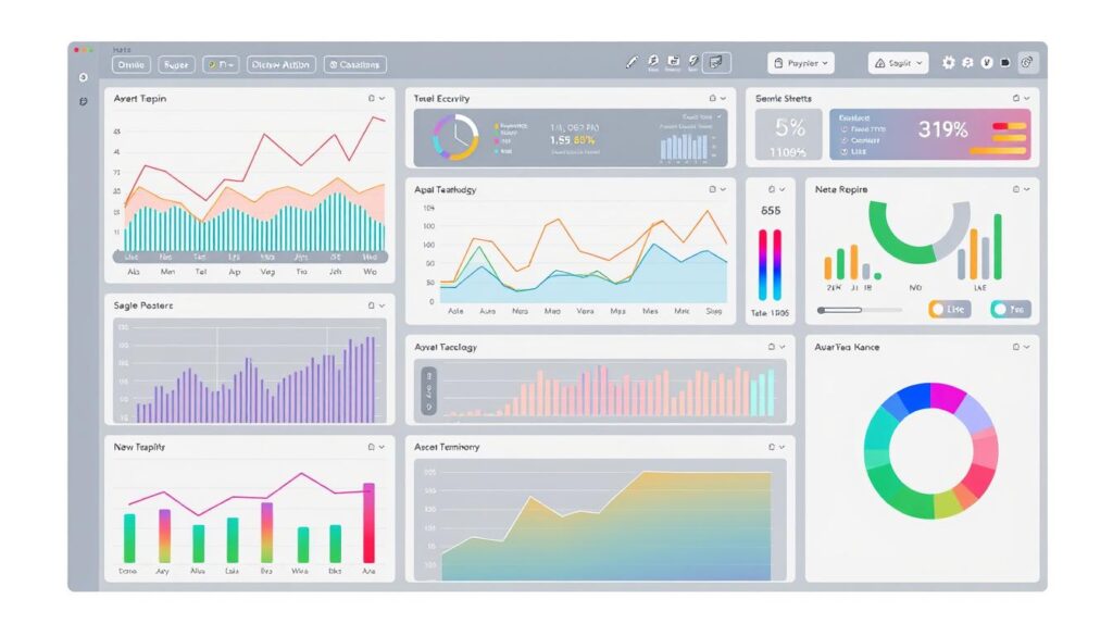
Designing Effective Dashboard Layouts
Creating a great dashboard in Looker needs careful planning. The first tile takes up the whole width. Then, tiles can be one-third of the width. You can move and resize tiles to make the dashboard look better.
Principles of Dashboard Design
When making a Looker dashboard, balance is key. Too many tiles slow things down. But, not enough tiles don’t give enough info. Stick to the best practices, like using no more than 15 tiles, for a smooth experience.
Choosing the Right Visualizations
Looker has many chart types, like line and bar charts. It also lets you add custom visualizations. Pick the right chart for your data to make it easy to understand.
Organizing Your Dashboard Elements
Where you put things on your dashboard matters a lot. Put important KPIs at the top left. Use the same colors for charts to make data stand out. Adding easy-to-use navigation helps users move around.
Good dashboard design in Looker is all about balance. The layout, choices, and organization should work together. This way, your dashboards will not only show data but also engage your audience, helping them make better decisions.
Customizing Visualizations in Looker
Looker has many options for customizing data visualizations. You can tweak chart types, add dynamic filters, or include interactive elements. This makes your data insights come alive.
Types of Visualizations Available
Looker supports a variety of chart types. You can choose from simple bar and line graphs to complex scatterplots and treemaps. Each type helps present data in a clear and impactful way.
How to Customize Charts and Graphs
The Chart Config Editor in Looker lets you customize most charts deeply. You can change colors, labels, and tooltips to match your brand. It also supports HighCharts JSON for even more customization.
Incorporating Filters and Parameters
Dashboards in Looker can be interactive with filters and parameters. You can adjust time periods, filter by product category, or by customer type. This makes it easy to find the insights you need quickly.
Using Looker’s custom visualizations, chart customization, and data filters can unlock your data’s full potential. You’ll create stunning, engaging dashboards that help make informed decisions.
Sharing and Collaborating on Looker Dashboards
Looker Studio makes it easy for teams to collaborate and share data dashboards. It uses strong access control and permissions. This way, teams can work together safely and efficiently.
Access Control and Permissions
When making a Looker dashboard, the person who creates it has the most power. They can manage who can see or edit the dashboard. Others can be invited to view or edit, depending on their role.
Those with the “Manage Access, Edit” role can change who can see the dashboard. They can also move things around and edit the dashboard itself.
Collaborating with Team Members
Looker’s tools let many people work on one dashboard at the same time. Those with the right access can add new parts, move things around, and write descriptions. This helps teams work better together and make decisions based on data.
Exporting and Sharing Your Dashboard
Looker dashboards are easy to share and export. You can make PDFs, send emails, or put the dashboard on websites. There are many ways to share, like public links or emails to specific Google accounts.
Using Looker’s dashboard collaboration, data sharing, and access control features helps teams use their data better. It builds a culture that relies on data and makes better decisions.
Maintaining and Updating Your Looker Dashboard
Keeping your Looker dashboard up-to-date is key to its success. Regular updates ensure it stays relevant. You might choose to refresh data hourly or daily, depending on your dashboard’s size and complexity.
Best Practices for Data Refresh
Looker offers various refresh options, like 1-hour, 4-hour, and 12-hour settings for Google Analytics and more. For complex data sources, refresh times can range from 1 minute to 12 hours. It’s important to balance data freshness with query costs, especially with BigQuery.
Monitoring Dashboard Performance
It’s vital to watch how your Looker dashboard performs. Look at rendering times, query costs, and user engagement. If there are issues, tweak the layout, visualizations, or data sources to improve it. The aim is to make the dashboard easy and fast to use.
Iterating Based on Feedback
Listening to user feedback is a great way to make your dashboard better. Encourage your team to share their thoughts on the dashboard’s design and usefulness. Use this feedback to make informed updates and keep your dashboard valuable for your team.

