
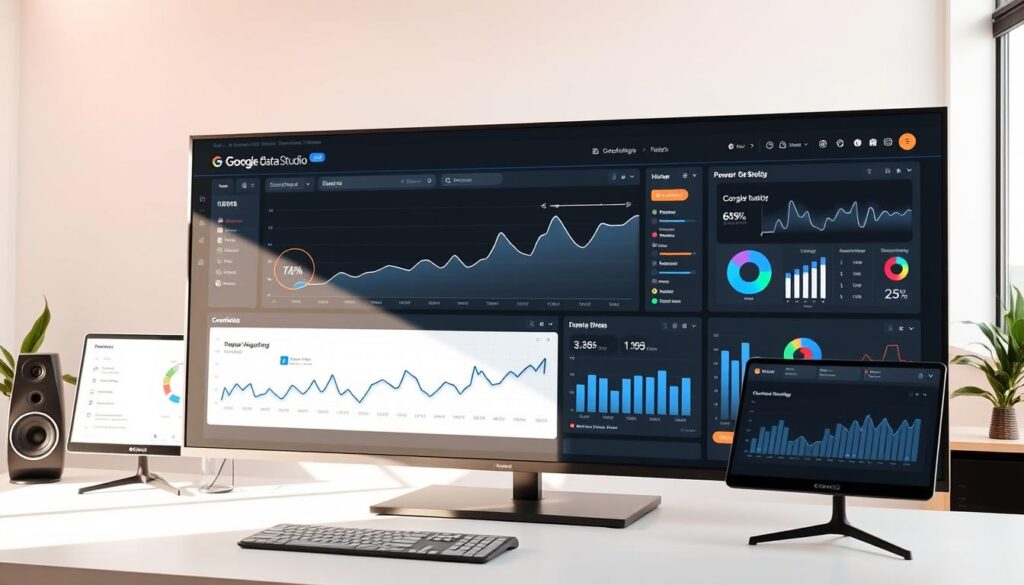
Did you know 90% of business leaders find it hard to make sense of raw data? Google Data Studio is changing that. It’s a powerful tool for turning complex data into easy-to-understand visuals.
As a digital marketing pro, I’ve seen how Google Data Studio can change the game. It lets users create stunning, interactive reports without needing to know how to code. My experience with it has been.
This tool is more than just software. It’s a key asset for businesses wanting to get more out of their data. Whether you’re in marketing, analysis, or leadership, Google Data Studio makes it easy to tell stories with data.
Key Takeaways
- Google Data Studio transforms complex data into visual narratives
- No advanced technical skills required to create professional dashboards
- Free platform with powerful visualization capabilities
- Seamless integration with multiple data sources
- Enables real-time collaborative reporting
What is Google Data Studio and Why Use It?
As a data professional, I’ve found Google Data Studio to be a powerful tool. It turns complex data into stories that grab attention. This tool makes it easy for businesses of all sizes to understand and use their data.

Google Data Studio is easy to use for making interactive reports. It connects well with google analytics integration. This lets users link many data sources and make dashboards that help make big decisions.
Key Features that Empower Data Visualization
The platform works with over 150 data sources, like Google Analytics and YouTube Analytics. It updates data in real-time. This means your reports always show the latest info, helping businesses act fast.
Versatile Applications Across Industries
Google Data Studio helps many businesses, from marketing to e-commerce. It lets them track important numbers, compare them, and find trends they might miss. The tool also lets users make reports that look professional and are easy to understand.
Data visualization is not just about presenting numbers—it’s about telling a compelling story that drives action.
| Industry | Primary Use |
|---|---|
| Marketing | Campaign Performance Tracking |
| Sales | Revenue and Conversion Analysis |
| Finance | Budget and Expense Monitoring |
Google Data Studio turns data into visuals that help businesses make smart choices. It gives them the confidence to act on their data.
Setting Up Google Data Studio Accounts
Starting with data analysis software can feel daunting. But Google Data Studio makes it easy and fun. I’ll show you how to create your account and start using this powerful tool.

To start with Google Data Studio, you need a Google account. Go to the official Google Data Studio website and log in with your Gmail. The interface is easy to use, like other Google tools.
Creating Your First Account
Setting up your account is easy. Click “Start a New Report” to see the dashboard. Connecting your data sources, like Google Analytics, is simple with just a few clicks.
Navigating the Dashboard
Your dashboard offers many ways to create reports. Google has over 50 templates to help you get started. These templates are for different industries and needs.
| Data Source | Connection Ease | Recommended For |
|---|---|---|
| Google Analytics | Very Easy | Marketing Performance |
| Google Ads | Easy | Advertising Metrics |
| Google Sheets | Simple | Custom Data Management |
Connecting Data Sources
Make sure you have admin rights to connect data sources. Pro tip: Begin with Google Analytics to feel more comfortable. Each source you connect lets you create more reports.
By following these steps, you’ll learn to make dynamic dashboards. These dashboards turn data into useful insights.
Designing Your First Report
As a dashboard creator, I’ve found Google Data Studio to be a powerful tool. It turns raw data into engaging visual stories. Creating your first report might seem tough, but with the right steps, you’ll get good at making insightful presentations.
Start by looking at the many templates available. Google Data Studio has lots of pre-made layouts for different reports. Pick a template that fits your data and what you want to show.
Selecting the Right Visual Components
Your tool has many chart types to show data well. You can use scorecards, pie charts, and time series graphs, each for a specific purpose. Try out different charts to see which tells your data’s story best.
Customizing Your Visualizations
Customizing is important for engaging reports. You can change colors, fonts, and styles to fit your brand or needs. Google Data Studio’s tutorial shows how to make your visuals stand out.
Enhancing Interactivity
To make your dashboard interactive, add features like data filters and date selectors. These let viewers explore data on their own, making the experience more fun and personal.
Sharing and Collaboration in Google Data Studio
Collaboration is key in data analysis. Google Data Studio changes how teams work together. It makes complex tools easy to use for everyone.
Configuring Sharing Settings
Google Data Studio has great sharing options. You can decide who sees what. From just looking to editing, you control it all. Granular access controls keep data safe while helping teams work together.
Collaborating with Team Members
Working together is easy with Google Data Studio. It’s like Google Docs, but for reports. Many can work on one report at the same time. This is great for big projects.
Publishing Reports for External Access
Sharing reports outside your team is easy. Just make a link and share it. You can also embed reports or send links with specific permissions.
The key to effective data sharing is balancing accessibility with security.
Learning these features makes Google Data Studio more than just a tool. It’s a powerful way for teams to share and make decisions based on data.
Tips for Advanced Data Analysis
As a data pro, I’ve found Google Data Studio to be incredibly powerful. It turns simple data into detailed stories. Learning these advanced skills can really boost your reporting.
Exploring calculated fields lets you create unique metrics and dimensions. With Google Data Studio’s built-in functions, I can do complex calculations. This reveals hidden patterns in data that standard metrics miss.
Using Google Data Studio with tools like Analytics and Ads takes your analysis to the next level. I suggest trying data blending to mix different data sources. This gives a full view of performance across platforms, aiding in strategic decisions.
When making visualizations, focus on being clear and impactful. Choose charts that tell your data story well. Use colors wisely and think about your audience’s understanding. The right visualization can make complex data easy to understand and act on.

