
Did you know 78% of data analysts face challenges with time-based reporting? Learning about date range dimensions in Looker can change how you analyze data. It turns complex time data into clear, useful insights.
As a data expert, I’ve found that knowing about date range dimensions in Looker is key. It helps create strong, time-focused visualizations. Looker Studio has great tools for diving into time data, showing trends that might be missed.
I aim to make working with Looker date range dimensions easier. I’ll share useful tips to boost your data reporting skills. With these strategies, you’ll make dashboards that tell a powerful data story.
Key Takeaways
- Date range dimensions are essential for time-based data analysis
- Looker Studio provides flexible tools for temporal data visualization
- Understanding date range filters can unlock deeper insights
- Proper implementation leads to more accurate reporting
- Customizable date ranges enhance data exploration capabilities
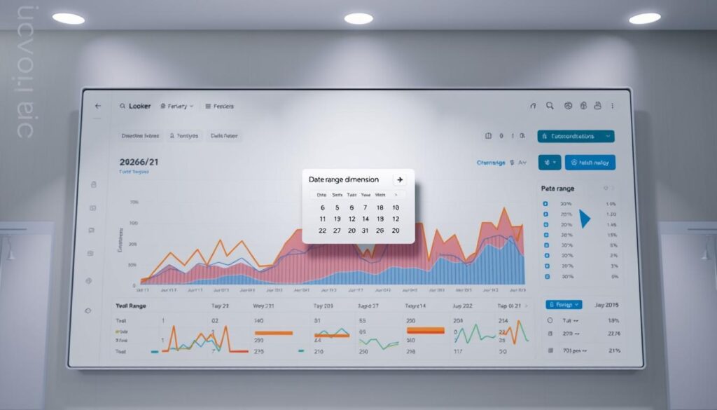
Understanding Date Range Dimensions in Looker
Getting the most out of data analysis means focusing on time-based insights. Looker dimensions help break down big datasets into smaller, more understandable parts. With date dimension in Looker, analysts can turn raw data into useful strategies.
What Are Date Range Dimensions?
Date range dimensions are special fields that let users look at data over specific times. They help explore patterns from daily to yearly. This way, data experts can find detailed insights for better decision-making.
Importance of Date Range in Data Analysis
Time-based analysis is key for business insights. It’s vital for tracking marketing or sales trends. Precise temporal filtering lets companies:
- Compare different periods
- Spot seasonal changes
- See long-term growth
Good data analysis is about understanding the story behind the numbers over time.
Using looker dimensions wisely, businesses can turn data into insights that lead to real change.
Setting Up Date Range Dimensions
Setting up date range dimensions in Looker reporting is key. It’s important to understand the setup process for meaningful insights. I’ll guide you through the steps to set up your date dimensions well.

Creating Precise Date Range Dimensions
To start, pick the right data source. Connecting your data sources is the first step. Use the Looker Studio data connector for easy integration.
Avoiding Common Configuration Mistakes
There are common mistakes to watch out for:
- Incorrect date formatting
- Overlooking time zone differences
- Misinterpreting dimension versus filter settings
When setting up date ranges, being precise is key. Always check your setup for accurate reporting. Create custom date ranges that fit your analysis needs.
Pro tip: Use relative date ranges like ‘last 7 days’ or ‘current month’ to maintain flexibility in your analysis.
Mastering these techniques will improve your looker reporting. You’ll get deeper insights from your data.
Advanced Techniques for Date Range Dimensions
Mastering date range dimensions in Looker analytics is key. It turns raw data into useful insights. By using advanced strategies, data analysts can make date range filters in looker more powerful. This boosts reporting abilities.

Advanced date range filtering lets users create flexible reports. I’ll share tips for deeper data exploration and visualization.
Customizing Date Range Filters
In Looker analytics, customizing date range filters is essential. It goes beyond standard time frames. I suggest creating filters that match business cycles, like fiscal quarters.
“Effective date range dimensions transform data from static numbers into dynamic narratives.” – Data Analytics Insight
Utilizing Parameterized Date Ranges
Parameterized date ranges add flexibility to looker analytics. These filters let users change time periods easily. This makes reports more adaptable and responsive.
| Technique | Benefit |
|---|---|
| Rolling Window Calculations | Enables continuous trend analysis |
| Comparative Period Analysis | Facilitates year-over-year comparisons |
| Dynamic Time Slice Reporting | Supports flexible data segmentation |
Using these advanced techniques, analysts can build smarter reporting systems. These systems offer deeper business intelligence insights.
Best Practices for Effective Date Range Analysis
Mastering looker date range analysis needs a strategic plan and a deep grasp of data visualization. Through my work with Looker analytics, I’ve learned key insights for spotting important trends over time.
For analyzing trends, I suggest using different visualization methods. Line charts are great for tracking ongoing data. Heat maps, on the other hand, show complex seasonal changes. Each type gives a unique view of your data.
Integrating Dimensions for Deeper Insights
By combining date ranges with other dimensions, you unlock deep analysis. For example, mixing geographic data with time trends can highlight regional differences. In my Looker analytics work, I often compare date ranges with product categories to uncover detailed market trends.
| Visualization Type | Best Used For |
|---|---|
| Line Charts | Tracking Continuous Trends |
| Heat Maps | Revealing Seasonal Patterns |
| Scatter Plots | Identifying Correlations |
Creating effective dashboards means picking the right date range views. Short-term and long-term views give a full picture of data. This ensures that everyone understands both current and past performance.
Troubleshooting and FAQs
Working with date dimensions in Looker can sometimes be tricky. It might slow down your data analysis. I’ve put together a detailed guide to help you tackle common issues. It’s designed to meet your Looker reporting needs.
One big problem users face is wrong date formatting and unexpected results. When using date dimension in Looker, check your timezone settings. Make sure your data input formats are consistent. This can avoid big mistakes in your time-based analytics.
Resolving Common Date Range Challenges
Dealing with cross-timezone analysis can be tough in Looker reporting. Use standardized timezone settings and Looker’s date transformation tools. This helps solve these problems. Knowing how different data sources handle time can make your reports more accurate and reliable.
Learning Resources and Support
To get better at Looker, check out the official documentation. Join community forums and take online courses. Google’s Looker learning platform has great tutorials. They can really boost your data analysis skills and help you master date range dimensions.

